Role: Head of Product & Design
The Venture Harbour website is more than just a digital presence—it’s a product in its own right. Its blog ranks highly for marketing-related topics and attracts a substantial audience of professionals in the space. The blog also serves as a revenue stream, monetised through affiliate links and partnerships embedded in its articles. Success here hinges on two things: compelling, well-crafted content, and high-performing, fast-loading pages that deliver a seamless and engaging reading experience. These elements work together to ensure strong search visibility and ranking on Google.
Over the years, we’ve continually refined the design and performance of the site. In 2020, we took a major step forward by rebranding Venture Harbour and rebuilding the website from the ground up. Our goal was ambitious: boost overall performance by 20% and increase affiliate revenue by 15%. While still early, we’re well on track, thanks to a set of focused improvements:
Migrating to a static site architecture to dramatically improve page load times
Optimising typography and imagery to enhance readability and user experience
Introducing new content categories to reduce bounce rates and encourage cross-content discovery
Putting people at the heart of the site—with more human-focused design elements to build trust and connection
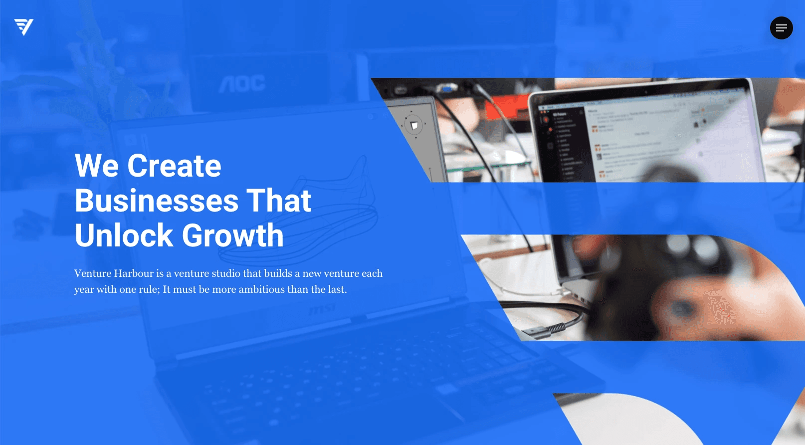
Website: Ventureharbour.com
Responsibilities:
Leading design & rebranding
User testing and discovery sessions
Hands-on design work with Figma (UI/UX)
Website rebrand and build
A core focus of the rebrand was to realign the company’s evolving vision and business goals with a brand identity fit for the next decade. The original brand—untouched for nearly ten years—no longer reflected who we were or where we were heading. Our aim was to create a timeless identity, one that would stand the test of time just as the original had.
To kick things off, we ran a brand sprint, bringing together key stakeholders across the company. This helped us gather essential insights quickly, build alignment early, and move forward with clarity and momentum.

Website blog
A key objective of the rebrand and redesign was to optimise both performance and engagement across our articles. To enhance performance, we meticulously audited every asset on the page—images, icon sets, and font libraries—removing anything unnecessary. We then converted all pages to a static architecture, significantly reducing time to first byte and improving load speeds. As a result, Google’s crawler activity increased by 30%, indicating stronger search performance.
On the engagement side, we focused on two core metrics: time on page and clicks on calls-to-action (CTAs). To move the needle, we made targeted design improvements. Faster load times played a vital role in reducing drop-offs, while content readability was improved through more legible fonts, larger font sizes, and better line spacing. We also redesigned our CTAs—increasing their size and refining the copy—to make them more noticeable and persuasive.
It’s still early days, but the initial results are promising, and the metrics are all trending in the right direction.